A redesign of KorailTalk app
challenge: I participated in the Digital Government Service Idea Competition. Participants were assigned to choose one of the 12 government service apps and redesign it to improve the user experience. I chose a mobile application for reserving tickets for all railroads in Korea. Even though I was not awarded, this was a valuable experience to apply the theories I learned by myself.
Methods: Competitor Analysis, Interview, Heuristic evaluation, Affinity diagram, User Map, Wireframe, Prototype
Team: Self-initiated project
Tools: Figma, Illustrator
My Role: UX researcher, UX/UI designer
Prototype


.png)

About KorailTalk app
KorailTalk is a mobile application for reserving tickets for all railroads in Korea. Here are some of the key features that KorailTalk provides.
• Real-time train delay information.
• Deliver tickets to others.
• You can choose the seat you want.
• You can buy a commuter ticket at a special discount.
*These are the user interfaces of KorailTalk before a redesign


Heuristic evaluation


Comparative analysis
Greyhound(US express bus ticketing app)


Korean Air(airplane ticket booking app)

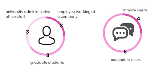
Interview/ Raw data overview
I conducted interview with 9 users

Persona

Affinity diagram

Feedback

Wireframe


Recommendations
Before/After
I made a clear distinction between the color blue and white to make the design simple. In addition, I made boxes to input the date/location of departure and arrival and the number of passengers.


a. The problem with the original app was that users click "book" even before choosing seats. So, instead of giving the choice between "book" and "choose a seat", I made it mandatory for users to choose the seat first and book a ticket later.
b. I added a travel time so that users can quickly compare the shortest and longest travel.

Travel time
Price
Seat selection
Book


b

a
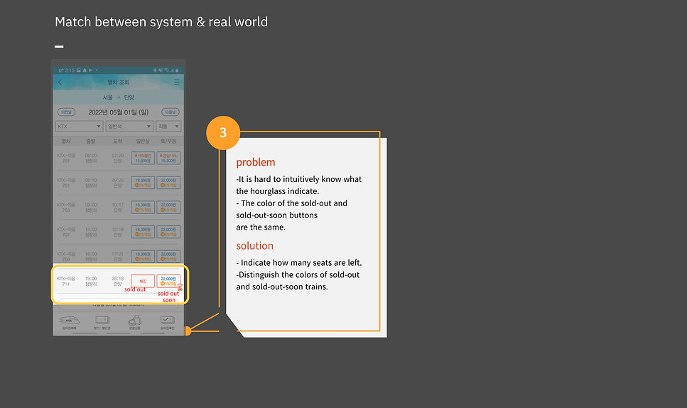
The problem with the original app was that the process of booking a transfer train was hard to grasp at once. This was mainly because the difference between the thin and thicker grey lines was not distinguishable. So, instead of the grey lines, I put each section on a card, making it more distinguishable.


Users did not know the exact meaning of the 'hourglass', which is supposed to mean 'sold out soon'. So, I replaced the hourglass with the red words, 'Almost sold out'.


Through the interviews with a few users, I got the insight that the information about the seat on the train is important for good travel. Many users said whether the seat has a hanger or battery charger is important factor for travel satisfaction.


Design solution
Onboarding


Buy train tickets(Direct)


Buy train tickets(Transfer)


Cart


My page
Home
Cart
Ticket


